As I have been saying since over two months that the Nifty looks weak, the Nifty, as if listening to my analysis is doing exactly as I am predicting. This is not a good sign, at least not good for me. And the reason for that is that the market does not listen to any analyst and moves in a fashion known only to itself. And since there are a limited number of movements that the market can show, a few analysts may have their good days till the market decides to bring them back to Mother Earth. Not a good sign for me, because I'm having good days these days and only the market knows, how many days to prove me right. But, never mind that, my job is to analyse the markets and take trades in the direction of the trend and not try to fight and change the trend when the markets decide so.


Showing posts with label Candlesticks. Show all posts
Showing posts with label Candlesticks. Show all posts
Sunday, March 17, 2013
Nifty Weakness Continuing, Next Target 5528
Posted by


Thursday, November 01, 2012
Sudden Bullishness Seen on Bearish Charts
In the first half of the day, the Nifty was still uncertain about which way to go. It opened slightly in the positive, came down in the red, went to the greener territories again and then back into the red. Just like a yo-yo. But then a surprise came. The Nifty suddenly started going up at around 1 pm and then there was no looking back for it. It went up as if it was never bearish. But does that mean the bearishness is over. Maybe, but we would need more confirmation before we change our view to bullish. What's going to happen in the future, only the market can tell us. We can only make predictions and predictions can sometimes go wrong too. The only mantra to success is that we recognise the change of trend as early as possible and not try to fight the markets when the markets have proved us wrong. Maybe, just maybe, what we saw today was the first sign of the trend changing.
 Attached above is the daily chart of Nifty. As can be seen, it wasn't a big range candle. With a high of 5624 and a low of 5583, it was a range of only 41 points, which is not even a percent. A blue candle just a day after a downside breakout is not what's surprising because a pullback to 5630 was to be expected anyways. What's surprising is the strong one-sided upside pullback in a bearish trend. This is indicative of a stronger uptrend. Another thing that's surprising is that till yesterday most shares were displaying bearish patterns, and today most of them were bullish. Just to give you an idea, I did a quick scan to see how many stocks moved more than 3% up or down. And out of the stocks that I track, there were 15 such stocks. Out of these 15, only 2 stocks were more than 3% down while the remaining 13 were more than 3% up. Forget me, don't YOU find that surprising?
 Seen above is the daily chart of Zee Entertainment. Now, this is such an interesting pattern. As can be seen, yesterday it tried to go below the 5 month old trendline, couldn't sustain at lower levels and made a hammer after a fairly decent downtrend. A hammer formation after a bearish trend is always a bullish sign. But we still needed that one blue candle for confirmation. And the confirmation came today, and oh, what a "resounding" confirmation with such a long range candle. What gives more confirmation to the expected uptrend is the RSI shifting back upwards from 40. I expect Zee to continue to go up and I see a target of not less than 209, could be more.
 Attached above is the daily chart of Hindalco. Till now Hindalco was beaten and battered and was keeping a very low profile and was keeping quite subdued. A long range blue candle along with an Engulfing Pattern candlestick pattern suggests there is more upside to see. What gives it more strength is the fact that the RSI changed direction from 40. Moreover, the stochastics oscillator couldn't have been better placed going below 20 and just changing directions and is showing signs of improvement. While signs are already visible, that this time the trendline will be broken through but for now, we shall play it safe and assume a target near the trendline at 124 (and more if the trendline is broken through).
 Attached above is the daily chart of Bata India. There seemed to be quite a good support between 865 and 870, as can be seen from the trendline. With that broken through without difficulty and quite decisively, there seems to be no difficulty predicting that there is more downside yet to be seen. The levels? Well, maybe, 770.
 Crompton Greaves, on its daily chart, had been moving along in a downtrend since the beginning of
 days the chart, had broken through the trendline and was now going through a pullback, which is quite usually seen after a breakout. Some people, including Franklin Sanders, call this pullback as the last kiss goodbye. This just means that it had decided to go, started to go, then just turns back as if it has forgotten the kiss, comes, kisses the trendline and then, finally, leaves never to come back again. Well, not in the near future at least. What I liked about this chart is that it came back to the trendline, almost within, kissing distance before turning back again. Moreover, the RSI and stochastics are placed just where I like them to be (specially when I'm looking to buy). I would say, a target between 155 and 160 should not be too difficult for Crompton to achieve. It may just have to "greave" around a bit near 140 and 147 which may act as resistance levels.
Please do subscribe to my posts, so that all posts are delivered free to your inbox and you don't miss any useful analysis of the markets in the future.
Happy Investing!!!


Posted by
Friday, September 19, 2008
Rakesh Jhunjhunwala Positive On the Markets
Since a number of days now, I have been talking of a target of 3800 on the Nifty. This morning because of the global weakness the Nifty opened weak and touched that target of 3800. In fact, so close was the prediction that today’s low on the Nifty happened to be 3799.55. And once the target was achieved, the Nifty started moving up. The move up was steady and consistent and so good was the recovery that the Nifty finally managed to close near the highs of the day with a gain of 30 points. The high made today was 4050.10, which means an intraday recovery of 250.55 points. Such a good day changes the outlook totally. Crude, as of now, is trading flat near $96 while gold, after a stunning $70 rise yesterday is up again by $46 or 6%.
 Seen above is the daily chart of the Nifty. Three days out of the last four have displayed candles with long lower shadows, as marked by the green arrows. Two of these candles have very small bodies and, in comparison, very long lower shadows. Today’s candle, in candlestick charting parlance, is also called a hammer. And it is named a hammer not only because it looks like one but also because such candles are found near the end of a downtrend and it is said that such candles are ‘hammering out a base’. Options outlet says the following about a hammer.
  So, is this the end of the bear market? Well, we can’t say for sure. The prices have started ‘hammering out a base’, inflation has stabilized, crude prices have softened and India does not seem to be having too much of an impact of the credit crisis in the US. Who knows, this may be the end of the bear market. But hey, look at the world around you. There is so much of pessimism around. Surely, India cannot remain insulated from the problems in the rest of the world. Hmm, maybe it cannot. Or maybe it can. But as far as pessimism around the world is concerned, I would again like to point out what Sir John Templeton said. He said that “Bull markets are born on pessimism, grow on skepticism, mature on optimism, and die on euphoria.”
Rakesh Jhunjhunwala, according to Moneycontrol says that India is still in a long term bull market and that the current phase is only an interruption to that bull market. His logic is simple. That had we seen the market rise from 3000 to 13000 and then come down to 11000, it would have been termed as a correction. Now when we have seen so much of greed and so many excesses that the markets went to 22000 and then came down to 13000 then why are we not calling this phase a correction too? Shireen Bhan, in that context, in conversation with him mentioned that we have recently seen ‘the mother of all bull markets’ to which Rakesh Jhunjhunwala immediately disagreed and said the ‘the mother of all bull markets’ was yet to come. This conversation with Rakesh Jhunjhunwala will be telecast on CNBC this Saturday at 7:30 pm or Sunday at 10:30 pm. Watch it.
Shankar Sharma of First Global, though, remains a bear and says that the Sensex may not be able to reconquer its previous highs for the next 2-3 years and that it may come down to 10000-11000 levels.
But Vikas, where does that leave us? Do we remain bullish or bearish? Well, I have given you both sides of the market. You decide for yourself what you want to be. I, personally, am not too bearish on the markets, especially after seeing the candles formed in the last four days.
Please do subscribe to my posts, so that all posts are delivered free to your inbox and you don't miss any useful analysis of the markets in the future.
Happy Investing!!! Read the Full Post Here
Posted by
Thursday, July 31, 2008
Nifty Displays 'Three Black Crows' Candlestick Pattern
There was good news from the American and Asian markets this morning. The Dow was up 266 points and all Asian markets were between a percent to two percent in the green. Because of these reasons, the Nifty opened with a positive bias and continued to take prices up throughout the day. With so much of cheer the world over, our markets happened to be cheerful too and the Nifty ended the day 123 points in the green while the Sensex closed 495 points above yesterday. There was good news from Europe as well. The closing was good two. Both the London FTSE and the French CAC closed almost two percent up while the German DAX ended with a gain of a percent. The news from around the world may not be all that good tomorrow. The American markets opened in the green today and while the Dow Jones has lost all its gains by now, the Nasdaq is already in the red. The crude front is also not looking all that healthy today with the crude already trading above $127 a barrel.
 Attached above is the daily chart of Nifty. The Nifty, as can be clearly seen, has reversed after testing the top of the trend channel. This was expected since the 4180-4200 support is quite a strong support. Yesterday we did see the Nifty go down to a level of 4160 intraday but it closed at 4190. If we have another day of upmove tomorrow and if the prices were to go above 4350, we would have a pivot low in place at 4160. A pivot low formed at 4160 would mean that the Nifty has finally formed a pattern of higher highs and higher lows, which would bring the Nifty back in an uptrend. Back in an uptrend means, we should be buyers now and our stop loss for all long positions should be the most recent pivot low at 4160. But before we go on to buy, we should be aware of the different definitions of an uptrend. Technically, a stock (or an index) comes back in an uptrend when it goes up, comes back down to form a low (which is higher than the previous low) and then goes back up above its previous high. Quite often the prices first go on to make a higher high (like the Nifty displayed this time around) and then form a higher low. Here there are two schools of thought. One says that the uptrend has started, whereas the other school waits for the prices to go back above its previous high (in which case it makes it two higher highs and a higher low) before buying. Needless to say, the second school of thought has a much better chance of making a profit. And it is also understood that it is the first school which buys at a cheaper price and makes more profits if the signal turns out to be correct for them.
I would normally side with the first school rather than the second but it all depends on the situation. At present, if the Nifty were to go above 4350 tomorrow, there is resistance close by near 4480 (this level will keep reducing every passing day) as suggested by the trendline. What if the Nifty were to reverse from this level? I’ll be making a profit of only 100 odd points, which is not much. Also, there is likelihood that the candlestick pattern formed here is that of ‘three black crows’, which gives a very negative outlook to the Nifty. Had the small narrow range blue candle, formed on Monday, not been there, this would have been a classic ‘three black crows’ pattern, which happens to be a reversal pattern. It is the presence of this blue candle that creates doubts. The ‘three black crows’ candlestick pattern usually follows a period of strong advance and within this pattern three black(in our case, red) candles/shaded candles are formed with non-existent or small lower shadows. These three candles have lower highs and lower lows. Usually, the fourth candle is a white/blue/unshaded candle but could also be a black/red candle. The fifth or the sixth candle, generally, takes the prices below the low of the ‘third crow’. If this does turn out to be a ‘three black crows’ pattern (ignoring the blue candle formed inbetween the crows) and the low of 4160 is broken in the next one or two days, we could be looking at a retest/breakthrough of the 3800 lows too. For now, I would much rather stay with the second school of thought and buy only if the Nifty were to go above its previous high of 4540.
Please do subscribe to my posts, so that all posts are delivered free to your inbox and you don't miss any useful analysis of the markets in the future.
Happy Investing!!!
Read the Full Post Here
Posted by
Friday, June 06, 2008
Candlesticks Piercing Pattern Made in Nifty Today
The Nifty today opened flat and remained so for the next 2 hours before it started slipping. It went on to make a low of 4536.25 which was very close to our support of 4530 as mentioned here. It was from here that the recovery started and what a recovery it was! A climb of more than 150 points from the day’s lows. It gave us a nice big blue candle, which was quite a relief after losing 350 points in 3 days.
 Seen above is the daily chart of the Nifty. Looking at the last two candles, according to candlestick charting, we got a very good piercing pattern. A small image is also given below to help you understand what a piercing pattern is.
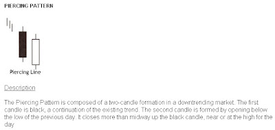 The criteria to recognise a piercing pattern is the following:
 Seen above is the daily chart of the Nifty. Looking at the last two candles, according to candlestick charting, we got a very good piercing pattern. A small image is also given below to help you understand what a piercing pattern is.
 The criteria to recognise a piercing pattern is the following:
 - The body of the first candle is black (shaded); the body of the second candle is white (unshaded).
- The downtrend has been evident for a good period. A long black candle occurs at the end of the trend.
- The second day opens lower than the trading of the prior day.
- The white candle closes more than halfway up the black candle.
If you notice these criteria, you would see that today’s pattern on the chart fits exactly with this. This may probably mean that this is the end of the downtrend, at least for sometime. For the time being, let us forget the head and shoulders pattern that we saw yesterday and hope for the best. More candlestick patterns can be read on this page.
I got a few mails today in response to the post I wrote yesterday. A lot of my readers were “disheartened” by my analysis of the markets and the ‘shuddering’ thought of the Nifty possibly going to 2600. One of them even asked me to ‘give some rays of hope’. I forgot that, like a doctor keeps giving hope and comfort to his patients and his/her family members even if the survival chances are bleak, I too, with so many blog readers, need to ‘give rays of hope’ when the markets are looking bad.
Yes, I understand that I may have painted a very grim picture yesterday but I thought my readers had to be aware of what could be a possibility. It is to be understood that it is only a possibility and not a certainty. More risk averse investors should be getting out of the markets if we were to go below 4450. And how will they exit if I don’t tell them where to exit? I have to cater to all audiences and it is my duty to bring out all possible scenarios. I admit that I may have erred by not including the positives in yesterday’s post.
Well, all is not lost yet. We have support at 4530, which held today. The three year trendline (and not the eight year trendline that one of my readers got confused with) that the Nifty might break is a very long trendline and one odd going through the line is not considered as a breakdown, it needs to be consistently below the line for a week or so to get a confirmation of a breakdown. Secondly, the head and shoulders pattern shown yesterday was on the weekly charts and took a year and 4 months to form and the target could take as long to be achieved. Markets change drastically in such a long time and such large patterns are more likely to fail than short term patterns. And today’s piercing pattern boosts our morale a little. All may not be lost yet.
In my webinar on moving averages I had mentioned that when multiple moving averages converge together or come very close to each other it means that a big movement is about to come. This is a derivative of the age old Dow Theory. One of the tenets of the Dow Theory is that ‘lines indicate movement’. By ‘lines’ Charles Dow meant the prices moving in a very narrow range or within a small rectangle. This narrow range usually indicates that a movement is about to come. About moving averages when they converge together it means the prices have been moving very close to a particular price level for long (in the present scenario the 5000 level) because of which all moving averages are also very close to each other. This indicates a ‘lull before the storm’ or that a big movement is about to come. This movement could be either up or down. On the past several occasions it has happened that after such a scenario the prices went up but they could very well go down too. This theory only states that a big movement will/may come and does not necessarily state the direction of the movement. One of my readers mistook it to mean that it meant prices would go up. In the present scenario all moving averages are pretty close to each other and they indicate that a big movement is likely anytime soon. This could be on the downside if we go below 4450 or on the upside if we cross 5300. Let us all hope for the best and let the markets decide which way they want to go.
In my post dated 27th May 2008, I had advised buying Nifty 4800, 4700 or 4600 puts or buying a 5000 call and selling 4600 or 4500 call. Let us see with the help of this table how much profit we would have made if we had followed any of those strategies on 28th May and covered the positions today with just one lot of Nifty (50 Nifties).
 Such good returns in a matter of only 8 days and that too when the market is going down and with a maximum investment of only Rs.16000 odd. And all these profits are on just one lot of Nifty. One with Rs.50000/- to invest could have bought 4 to 5 lots of Nifty options and could have easily ended up with more than a lakh in just eight days. Keep watching this space for more such strategies whenever they come. Subscribe to my posts now so that you don’t miss any such profitable strategies.
Happy Investing!!!
Read the Full Post Here
Posted by
Tuesday, June 03, 2008
Another Attempt At Elliott Wave Counts
The Nifty, taking the cue from red global markets, opened weak and within minutes of opening reached 4634, very close to the support of 4630, as was mentioned in the post dated 25th May titled “Nifty Breaks Important Support”. And from there it staged a magnificient recovery. Unfortunately, the recovery wasn’t enough to take it into the green but it was enough to end the day to form a doji candle (open and close at or very close to each other), as can be seen in the chart below.
 As has been discussed in various earlier newsletters, a doji after a downfall is a bullish sign in the short term and the same after an upmove is a bearish short term sign. Now whether this doji is strong enough to take it up in the next 2-3 days or whether the bears win over this doji is yet to be seen. An upmove from this level could take the Nifty to 4800 where it should find resistance again. A downmove will have to go beyond 4630 to reach our estimated support between 4500 and 4550. There was probably another reason for the support found today, as can be seen from the trendline marked with the arrow.
I had written a post on April 21st titled "Are we in wave 3 of Nifty?" in which I had mentioned the basics about Elliott Waves. You can read that post before you continue ahead so that you can recall what I had written that time.
In response to that post, I received an email from a subscriber of mine who wrote the following:
“Dear Sir,
I want to ask you that are we in bullish phase, after the corrective phase of A,B,C? Previously you have written an article "Are we in wave 3?". In the same line I want to add that, now we are in WAVE 2, shortly will enter in to WAVE 3. Below I have given the image for right understanding.
Want to know your comment on it.”
He has been very kind to attach a chart also which is self explanatory and needs no commentary. It is attached below.
 While the chart is beautiful, in my view, the analysis seems to be incorrect, at least at this moment. In my earlier post, which you have just read, I had mentioned that wave 4 should never never come in the price territory of wave 1. If it does, it means that our wave count was incorrect. That counting went wrong on 9th May when the Nifty came below 4970.80 (the high of wave 1), which led to the conclusion that it was either wave 2 forming, as my subscriber suggests, or maybe some other numbering pattern. It now seems that it isn’t wave 2 also that is forming because our target for Nifty is much lower, between 4500 and 4550. If that does happen then this cannot be wave 2 because wave 2 does not, generally, retrace more than 61.8% of wave 1. In this case it has already retraced a little more than that. In my opinion, we are still in the corrective waves A-B-C, which can also take the 3-3-5 pattern which means that wave A and B would each consist of 3 waves while wave C would consist of 5 waves.
 In the chart above, I have numbered the waves A-B-C in large capital letters and the waves within these larger waves as 1-2-3-4-5 in smaller font. I think we have completed the 3 waves of the corrective wave A, the 3 waves of corrective wave B and are in the 3rd of 5 waves of corrective wave C. This 3rd wave could go between 4500 and 4550 from where we will have a small bounce back which would form wave 4 (not to exceed 4900) of the C wave and then a downfall again, which would take the Nifty to 4100-4200 (or lower??). That would, probably, be the end of the bear market from where it will be a new beginning. That is what the Elliott Wave Theory tells us right now. However, I must admit that I am not a master of Elliott Waves and the market could again prove my numbering to be incorrect, if it so decides. I, like all other analysts, respect the market and believe that market is supreme.
According to a1samud, there is a very famous saying by Mahatma Gandhi, which I quote below:
"A customer is the most important visitor on our premises. he is not dependent on us. We are dependent on him. He is not an interruption in our work. He is the purpose of it. He is not an outsider in our business. He is part of it. We are not doing him a favor by serving him. He is doing us a favor by giving us an opportunity to do so.”
I would like to twist it a little to fit the relationship of analysts and the markets. Here is my version of it:
"The markets are the most important element of our lives. They are not dependent on us. We are dependent on them. They are not an interruption in our work. They are the purpose of it. They are not an outsider in our business. They are a part of it. We are not doing them a favor by analysing them. They are doing us a favor by giving us an opportunity to do so.”
Happy Investing!!!
Read the Full Post Here
Posted by
Monday, May 12, 2008
Markets Recover from Expected Support Levels
The markets started on a weak note today and had lost about 60 points on the Nifty within the first half an hour and then started making a slow recovery from 4920. It took almost two hours for the market to recover all its losses for the day and just when it managed to reach yesterday’s prices at 4983, the industrial production data was announced. According to the data India's industrial production growth sunk to 3 per cent in March 2008 from 14.8 per cent a year ago and Index of Industrial Production grew at 8.1 per cent in FY 2007-08, down from 11.6 per cent in 2006-07. It took all of ten minutes for the markets to lose everything that it had gained in the last two hours, and even more. This time it made a low of 4915 and started its recovery from there.


This time around support was found at 4915, between our support levels of 4910-4930. And this time the buying seen seemed genuine because the Nifty recovered 97 points from the lows of the day and closed almost 30 points in the green. What triggered the buying is unknown. Maybe it was the technical support (between 4910 and 4930), maybe it was value buying (seems unlikely), maybe it was bottom fishing or bargain hunting (again unlikely because one doesn’t bottom fish when the sentiment is weak), but it definitely wasn’t the sentiment that had changed. A few days ago, in this column, I had mentioned that “technical analysis does help, but sentiment holds the key”. Is it time to change the phrase to – “sentiment doesn’t matter, only technical analysis helps”?
The Nifty is currently standing at resistance at 5020 as shown by the downtrending line. If it were to remain/go above 5020 after 10:30AM then its next target would be close to 5150.
Read the Full Post Here
The Nifty is currently standing at resistance at 5020 as shown by the downtrending line. If it were to remain/go above 5020 after 10:30AM then its next target would be close to 5150.
 On the daily chart of DLF, we can see that it has made a series of three doji candles (candles where opening price and closing price are the same or very close to each other) and suggests that the short term down trend may be over in this stock and it should see a reversal from these levels. Another positive in this chart is that the RSI is still above 40 and if DLF reverses from here then the RSI will also reverse and a reversal from 40 for the RSI is a good sign. The only negative that can be seen is that the RSI reversed from 60 when the last high was made and that means that it is still not in an uptrend. So, this time we should be careful when the RSI reaches 60 and should maintain a long position in the stock if the RSI were to cross 60. For now, it seems to be a good buy above today’s high of 640 with a stop loss near 607 for a target between 720 and 750 (and more if the RSI were to cross 60). Do not buy if the price doesn’t cross 640.
 HDFC Ltd. rose from 2300 to 2900 levels, a move of over 25%, in just a matter of 10 days and then went through a brief consolidation, which has already lasted 8 days. A move above 2750 should confirm that the consolidation is over and it can give a move of another Rs.450/- in a matter of two weeks. If you can see the three trendlines on the chart, you can notice that it looks like an ‘F’ or a Flag complete with the staff. Look to buy above 2750 with a stop loss of 2600 for a target near 3200.
 IDBI, after a sudden downfall, went into a phase of consolidation for over 3 months and finally broke through the trendline, only to see a pullback back to the trendline. It has support at the trendline at 98 and today’s doji suggests that the support may have been found. Look to buy above today’s high of 102 with a stop below 95 for a target of 130.
Happy Investing!!!
Posted by
Wednesday, May 07, 2008
All Set to Go North
If you remember yesterday’s edition, I had mentioned that the Nifty may touch the 1 month long trendline and bounce back from there. That is exactly what happened today. The Nifty stayed within a narrow range throughout the day, but did go low enough to touch not only the trendline but also the support provided by the 23.6% Fibonacci retracement at 5102.25. We had also mentioned that Fibonacci retracements are sometimes pretty accurate. Talk about accuracy and we see that the Nifty made a low of 5101.50, accurate upto 1 point.
 Other signs of support being provided are that even though the Nifty came down about 50 points today, the RSI kept hovering around the same levels and did not break 40. Both the price touching the trendline and the RSI finding support at 40 has been marked by blue circles. While the Nifty still did close in the red today but a bounce back from 5101 to 5140 in the last hour is a pretty good indication that the correction may be over.
I am a firm believer in blue chips. Over the years, I have seen lots of ups and downs in the markets and it is always the blue chips which have the power to surpass their previous highs, no matter what they are. I know there are many buyers out there with purchases of L&T above 4500 and Reliance above 3300. They may be sitting on a loss today but with just a little patience I’m sure they will end up in a profit.
Mid caps and small caps have their advantages too. We can take advantage of the momentum and speculation in such stocks. The only problem comes when we are holding these stocks and the market crashes. Technical Analysis gives us clear targets and stop losses. And without fail one of these levels is touched before the other. While we are better at closing positions near the targets (though, greed stops us sometimes), we are horrible at booking losses. This is where the third biggest enemy of ours (after greed and panic), hope, comes into play. It stops us from booking losses because we have seen on a number of occasions when the prices bounce back after our stop loss is hit. But when following technical analysis, discipline is very important. It is only the disciplined trader who wins over the others. But I know 80-90% of traders are not disciplined. And they always get stuck with small caps and mid caps during market crashes. And which is why I try recommending only blue chips. It is only during times like today when there are no blue chips available, that I take the help of other stocks. But it has to warned that discipline is very important when taking such trades.
 Larsen and Toubro seems to have broken through its downward sloping trendline and seems to have completed a pullback to the trendline too. The doji day today (open and close at almost the same levels) suggests that the price may start going up tomorrow onwards. It seems to make sense because the RSI too has broken through its trendline and has gone through a pullback after the breakout so it has been moving in tandem with the price. It looks set for a target of around 3600 with a stop below 2890.
  Gokaldas Exports, a midcap stock, but a market leader in its industry of readymade apparels, also has made a bullish pattern on the charts. With the volumes not showing anything except the breakout volumes today, can’t say whether it is a true head and shoulders pattern or not but it definitely looks like one. With a stop loss below 204, one can buy it above 235 for a target between 290 and 300.
Happy Investing!!!
Posted by
Wednesday, April 16, 2008
Infosys Up, Markets Down
Nifty, after breaking through the 4630-4830 range, opened on a high today with but then failed to maintain the heights. As mentioned yesterday, a bout of profit booking set in because market participants are still scared of the markets and are happy with small profits. There is a lot of resistance to be expected between the 4950-5000 zone. On the way down 4830 and then 4630 are good support levels. Buying for the short term could be done at these levels. A move below 4730 will change the short term trend to down.
 As suggested in earlier newsletters, a trend in Nifty can develop only if it goes above 5000 or, God forbid, below 4500. As of now it seems as if going below 4500 is a remote possibility. On the daily charts the Nifty has made a doji pattern which means that the open and closing price were very close to each other. This represents indecision. And since dojis are normally found at the end of short term trends, and since today’s doji was found near the top of the range, we may expect the Nifty to come down for a day or two. It may then decide to find support near 4830/4630 and then reverse or continue its way down to 4480. Let us wait and see what it decides to do. A move above 5000 could take it up to 5450-5500.
Let us look at Infosys Technologies. Two days ago it closed at a price of 1421.90. Tuesday morning it came out with its results which were not brilliant but just in line with the expectations. Considering the hostile conditions in which Infosys was operating, such normal results may be called brilliant. Anyways, in the results, it confirmed that in accordance with its guidance of an EPS (Earnings per Share) of 81.5 given last year, it has actually delivered an EPS of 81.56. At a price of 1421.90 and an EPS of 81.56, the Price to Earnings Ratio (P/E) is 17.43x. For next year Infosys has given a guidance of an EPS of 92.30-93.90. And as is its reputation of exceeding its guidance, it may be able to deliver a growth of 17-19%, lets take it as 18%. At 18% and with the base at 81.56, next year’s EPS is likely to be 96.24. At an EPS of 96.24 and a price of Rs.1421/90- the P/E is only 14.77 which is very cheap. Just to maintain its current P/E of 17.43, Infosys would have to be priced at Rs.1677/-. This is the main reason why we saw it jump in the last two days.
In a year or two, the situation in the US should be better than what it is today. As the situation improves, the P/Es will have to be rerated. At 17x what is expensive today may even be cheap at 25x when the situation is better. Considering that the situation does not change drastically but only becomes a little better, we can easily expect Infosys, a market leader, to be trading at 22x its earnings. With an EPS of 96.24 and a P/E of 22, Infosys would have to be trading at Rs.2117/-. Since the markets always look into the future and assuming that Infosys again gives a guidance of 18% for FY 2009-2010, then the EPS in 2010 would be 113.56 and with an EPS of 113.56 and a price of 2117, it gives a forward P/E of only 18.64x which is not, in any way, stretched. It is very reasonable. So 2100 maybe the target one may be looking at a year from now.
 But what do the technicals say? Look at the daily chart of Infosys above. Two good days have pushed the price decisively out of the range between 1400 and 1550. This range breakout gives us a target of between 1650-1700. On the other hand, it has also broken out of its downtrending line and has come back in an intermediate uptrend. The target of this pattern is close to 1950. So, with a little bit of resistance between 1650 to 1700 it may go up to meet its target of between 1900 and 1950. It’s a buy now with a stop loss of 1520.
 As mentioned in earlier newsletters, we are inviting our esteemed readers to send in their contributions in the form of articles to be published on this page. Take this opportunity to voice your opinions to the world about the markets today, the markets in general or anything remotely connected to the markets. Please e-mail your articles and don’t forget to mention your name and location so that you are given due credit for the article that is published.
Happy investing!!!
Happy investing!!!
Update: This article was also published on the business and investing page of Reuters.
Posted by
Wednesday, April 02, 2008
Markets Poised To Head Up
The Dow Jones closed almost 400 points up last night and all Asian markets were up by about 3% this morning. As suggested in yesterday’s newsletter, such drastic movements in global exchanges are likely to have an effect on our markets too. As predicted, we also opened with a 3% gap but, unfortunately, that was not enough to sustain it throughout the day. All through the day the markets kept losing ground and by close they were absolutely flat.

The chart shown above is the daily chart of Nifty and is actually a repeat of an earlier chart because we have done this exercise in an earlier newsletter. We are talking about dojis here and what they signify. To understand a doji, one has to understand a candle first. Let us take the drawing given here. This shows four candles. A candle essentially consists of four prices, namely, the openin g price, the high of the day, the low of the day and the closing price. The highest point of the candle is the high of the day and the lowest point in a candle is the low of the day. To determine the opening price and the closing price, one has to see whether the candle is shaded or unshaded, or in other words, filled or unfilled. If the candle is shaded or filled, it means the closing price is lower than the opening price, which means that the price has gone down during the day. Similarly, in unshaded or unfilled candles, the closing is greater than the opening which means that the price has gone up during the day. These two prices are joined together to form a rectangle. This rectangle is called the body of the candle and the lines above and below this body are called the shadows of the candle. Now, let us see what a doji is. When the opening and the closing price of a day is the same (or very close to each other), there is no body formed and that is called a doji. So, in this drawing on the first and the third day the price has come down during the day. On the second day the price has gone up during the day and the last candle is a doji.
One characteristic of a doji that they represent indecision and that is why they are usually found at short term market tops or short term market bottoms. After a doji day, prices are likely to reverse their trend for the next 2 to 3 days. Now looking at the chart of the Nifty above, we have marked all (and almost) dojis with small blue arrows. And you can see that they are, generally, found near short term market tops/bottoms. Let us look at the period in Dec 2007 and Jan 2008 more closely. It can be seen that there are a cluster of dojis at the top during this period. It is important to look at the Relative Strength Index (RSI) also along with the price. While the price, during this period, was making higher highs and higher lows, the RSI was not doing so. This means that even though the price was going up, the strength of the index was coming down. That was a very clear indication that the market could come down. And that it did in January. What was not known was the magnitude of the fall. While a level of 5200 was visible but 4450 was not expected.
Now let us look at the months of February and March. The black lines signify the tops made by the market during this time. This means that the trend is down. The trend will turn to up when we have at least one higher bottom and one higher high. A higher bottom has already been made (hopefully) and a higher top would be made if the price were to go above 4971. Is that possible in the short term? I believe, it is. Why do I say that? Well, look at the chart. We have seen two doji days including today which must signify that a short term bottom has already been made or is close by. Look at the RSI. While the price has gone on to make a lower high, but the RSI during the same period (10th Mar onwards) has made a higher high, which means that the price may be coming down but the strength is actually increasing. This is what we call a bullish or a positive divergence. So, with these indicators one can make out that the price may change its trend soon enough. All we need is a close above 4971 and we will be back in an uptrend. For investors this may be the right time to build up long positions. For short term traders too that level holds significance because that level will confirm the bullish head and shoulders pattern, the target for which is 5400. This may be the right time to buy at the money or out of the money (if you want them cheap) calls. 4800 calls are available at around 140, 5000 calls around 65 and 5200 calls near 30.
As mentioned in earlier newsletters, we are inviting our esteemed readers to send in their contributions in the form of articles to be published on this page. Take this opportunity to voice your opinions to the world about the markets today, the markets in general or anything remotely connected to the markets. Please e-mail your articles and don’t forget to mention your name and location so that you are given due credit for the article that is published.
Happy investing!!!
Posted by
Monday, March 24, 2008
Short Term Positives Visible
A new feature has been introduced with effect from 3 Mar 2008. Now you can listen to an audio of all the posts written here. The link to the audio is at the end of this post. Click on ‘hear this post’ and a new window will open which will create an mp3 file and then read the post for you. Just make sure that your speakers/headphones are on. Now you can listen to the posts even in your car while driving to work, provided you have opened the page on your laptop. The biggest advantage is to the people visiting the site from their mobile phones. They can just click the link to the audio and the post will be read out to you. Great, isn't it?
Gap openings seem to have become the order of the day these days. In the chart below, I have marked all the big gap open days with brown arrows and you can see how abundant they are. Gaps are like mistakes or anomalies in a chart and the prices tend to cover up their mistakes just like we humans try to cover ours. That is why you can see on the chart below that when prices open with an upward gap, more often than not, the prices tend to move down in the second half of the day. And the converse also holds when the prices open with a downward gap.
As traders who use technical analysis, it is our job to make sure that we take trades in which we have a higher probability of making profits. We can never be 100% accurate but if we increase the probability of profits (in the trades that we take) with the help of technical analysis then we’ll never go in a loss at the end of the month. But how do we increase the probability of a profit? By looking at the charts and seeing what the positives in the chart are and what are the negatives.
We are looking at the chart of Nifty everyday and are seeing that there are more negatives than positives. We know that we are in a short term downtrend, an intermediate downtrend and a possible (but still not confirmed) long term downtrend. We cannot go long and make profits, unless the trend changes to up. And that will happen sequentially, which means that first of all, the short term trend would turn upwards, then the intermediate term trend would change and then the long term trend. So, we should be willing to take positions when the short term trend changes to up. But the short term price movements are sometimes very sharp, so we have to be ready and should be waiting at the sidelines to enter whenever the short term trend changes to up. This means that we should know in advance that what is the level after which the trend will change and what is the probability that it is a true breakout. That is where technical analysis comes in handy.
 Now, let us look at the positives and negatives in the chart above. The negatives first. As seen on the chart, the Nifty is finding resistance near the blue downward sloping trendline which is currently near 4675. The last pivot high was the high of the day today which is 4734. So, if the Nifty were to cross 4734, we would be in a short term uptrend. But from the chart shown in yesterday’s newsletter, we saw that there was a very strong trendline near 4750 on the daily charts and that is more likely to push the Nifty back than the short term uptrend pushing it up. And then there is the Relative Strength Index (RSI) which has made a bearish head and shoulders pattern, though it has not been confirmed as yet.
Now let us look at the positives too. One, the Nifty is finding some decent support near 4480 and it is likely that it may find support around those levels the next time it goes there. The second positive factor is the positive divergence visible between the price and the RSI. This means that the price is continuing to make lower lows while the RSI is making higher lows. This is a positive sign and signals that a change of trend MAY be near. And the third positive thing is that the last candle today is a doji which means that the opening price and the closing price of the last candle is almost same. We know that dojis are known to occur (mostly, though not always) at the end of short term declines/rallies. While dojis hold more significance on daily charts than on 60 minutes charts, yet the presence of a doji is a positive.
So, looking at the short term charts there are more positives than negatives. Yet, we cannot rule out the presence of a strong resistance line at 4750 on the daily charts. Under these circumstances, it may be advisable to wait until the price decisively breaks 4750. Though, unhedged long positions are not advisable on the Nifty now, yet buying some calls may not be a bad idea.
Happy investing!!!
Read the Full Post Here
Posted by
Wednesday, March 12, 2008
Markets Uncertain
A new feature has been introduced with effect from 3 Mar 2008. Now you can listen to an audio of all the posts written here. The link to the audio is at the end of this post. Click on ‘hear this post’ and a new window will open which will create an mp3 file and then read the post for you. Just make sure that your speakers/headphones are on. Now you can listen to the posts even in your car while driving to work, provided you have opened the page on your laptop. The biggest advantage is to people visiting the site from their mobile phones. They can just click the link to the audio and the post will be read out to you. Great, isn't it?
Today, we have got the daily chart of Nifty. It has been expanded to see the last 2-3 candles more clearly. Looking at the circled bar, which is known as a candle, formed 3 days ago and marked as circle ‘A’, we find that this candle has a long lower shadow, a very small body and a negligible upper shadow. This sort of a pattern is known as a ‘hammer’ in Japanese candlestick charting, simply because it looks like a hammer. A hammer signifies a short term uptrend. The same pattern, when it comes after a long uptrend, generally suggests a short term downtrend.

Now, let us look at circle ‘B’. We can see that this candle has got a virtually non-existent body, and a long upper shadow, with again a non-existent lower shadow. This sort of a candle is exactly the opposite of a hammer and is known as a gravestone. Since, this is also a doji (a candle which has no body), this is known as a gravestone doji. Gravestones/gravestone dojis are, generally, formed when there is a short term reversal. Today’s downmove after a big gap up is not a good sign and does signify a reversal, unless the Dow surprises us by going up another 400 points today.
Yes, it is true. The short term uptrend, however short it might have been, seems to be over. We are looking at a retest of Monday’s lows at 4650, unless we, somehow, manage to close above 4800 tomorrow and bounce back from there. It has been regularly happening in the past few weeks (ever since the big Monday and Tuesday crash in January) that whenever the markets start crawling a bit higher, a small bad news comes and our markets go haywire. This is what happens in a bear market. Good news are temporary and have no effect on the markets. The Dow closing 400 points in the green yesterday was a big positive (especially when our markets were already climbing) and our markets did open a lot higher. Later in the day the IIP (Index of Industrial Production) numbers came out and the industrial growth was reported to have been only 5.3% compared to 11.6% reported last January and against analysts’ expectations of 7.7%. This is a significant slowdown in production and will, in turn, have an effect on the GDP growth also. And in such ‘shaky conditions’ such numbers were bound to have an effect on our markets.
There will come a time when all bad news will be discounted for. More bad news will not affect the markets any more and the markets will be driven by the cheap valuations of the stocks rather than by bad news. That will be the new beginning. But when will that time come? It could be soon (near 4600) or may take longer (near 4100) or even longer (near 3800/3500???). Only the market decides that. We do not. The markets are supreme. We are not. We just follow the markets. We sell and make money in bear markets and buy and make money in bull markets. Follow the market, respect the market and it will behave like your best friend. Go against it and you are, probably, not going to find a worse enemy.
I was reading an article in the newspaper a couple of days back and it said that most stocks are available at the same prices as the prices when the Sensex was at 12000. The fundamental situation of India, or ‘The India Story’ as it is usually called, is still intact, but may have worsened a wee bit. And if the prices at 12000 warranted a ‘strong buy’, the same stocks at the same levels today should be considered a ‘good buy’.
While, it is not advisable to buy in situations when the downside target is not known, yet there is one stock which caught my eye and I would like to discuss it with you.

Shown above is the weekly chart of Siemens and we can see that it has been respecting a trendline in force since Oct 2005. After a steep rise last year, it is now 'on its knees' to 'kiss' the trendline. It should be assumed that it will once again respect the trendline and turn back. Downside risk seems to be minimal. However, the overall market conditions should not be ignored. Chances are that if the Nifty goes below 4650, this also could fall further (and that could be just the beginning of a major fall). So, a strict stop loss of 600 should be maintained. With this stop loss, it seems to be an excellent investment buy right now.
As mentioned in earlier newsletters, we are inviting our esteemed readers to send in their contributions in the form of articles to be published on this page. Take this opportunity to voice your opinions to the world about the fall today, the markets in general or anything remotely connected to the markets. Please e-mail your articles and don’t forget to mention your name and location so that you are given due credit for the article that is published.
Happy investing!!!
Posted by
Monday, February 25, 2008
Many Blue Chips Showing Strength

Looking at the last 7 days chart of the Nifty on this daily chart, we find that there is one blue candle, one red candle, one blue, one red and so on. This, along with the narrow range trading, indicates confusion and indecisiveness in the market. The green line just below today’s candle is the 200-day moving average of the Nifty. A close below that would be dangerous. Fortunately, it recovered before it reached there and closed the day about 80 points in the green. While the Nifty is expected to remain in this broad range of 4800-5500, there is support at the 200 day MA at 5030 and resistance, near the previous pivot high formed last week, at 5368.
 On the daily chart of Larsen & Toubro, the stock has made a higher low yesterday and is now near its resistance line. With a stop loss of 3385, it seems to be a good buy if it crosses 3520 and it looks good for a target near 4000. Notice the RSI also turning back upwards after touching 40.
  Ranbaxy was recommended in the newsletter of 22nd Feb. Unfortunately, on that day because of weak markets it didn’t cross our recommended level of 425. Today again it has knocked against its resistance line. The levels, now too, remain the same. Buy above 425 for a target of 500. However, we have now modified the stop loss from 340 to 390.
  Look at this daily chart of Reliance Communications. Two doji days (days having open and close at almost the same level) now with today’s doji with a long lower shadow should be a good bet. Also notice the positive divergence (price going down but RSI going up) between the price and the RSI. Also the RSI fails to breach the 40 level this time around. All these are positives for the stock. Look to buy above 600 with a stop loss of 550 for target prices of around 700 and then 800.
  This is the daily chart of State Bank of India. The trendline seen on this chart has been drawn from the lows made in April 2007 at a level of 915. It has been 10 months now and the stock is still finding support near this line. Touching of the trendline today and a doji day with long lower shadows with RSI above 40 are positives for this public sector bank. One could buy it above today’s high of 2140 for a target near 2600. There may be some resistance near 2280 so be careful around those levels. Keep a stop loss of 2050 for this purpose.
  We again have a chart with a trendline drawn from the lows formed in April 2007 (of course, that time it had a face value of Rs.10/- as compared to the Rs.2/- now). The price of Suzlon Energy today touched this trendline and is currently trading below its 200 day moving average at 319, with today being the 4th consecutive close below it. Stay away from it for the time being. All long positions should be closed on a close below 290.
Happy investing!!!
Posted by
Friday, February 22, 2008
Pharma and IT Sector Good to Invest Into
The Nifty opened on a positive note today, found resistance immediately near 5240, came down in the mid afternoon session to reach yesterday’s lows of 5120 and in late trade again showed a good recovery to close at a level of 5210.

What we are seeing here is a 30-minutes chart of Nifty along with its RSI (Relative Strength Index) at the bottom. This chart has been shown with a number of trendlines, arrows and numbers. Try not to get confused with so many of them. If you want, you can right click on the chart with your mouse and select – “open link in new window”. That will open the chart as a larger image in a new window and toggle between the two windows to read in one window and to see the chart in the second. Let us look at the most recent set of arrows and trendlines (marked by 1). In this you can see that the price has made a bottom at the same level as yesterday whereas, correspondingly, the RSI has made a higher bottom. This is known as a bullish divergence or a positive divergence. This gives an early indication that the downtrend may soon be over. The actual confirmation comes when the price breaks the trendline, which it did in the last 30 minutes. This suggests that we should see the price going up tomorrow onwards. How long this new uptrend will last, only time will tell.
Let us go a little earlier in the chart, say the period between 14th and 19th Feb (marked by 2). We can see in this that the price continued to make higher bottoms while the RSI, at the same time, continued to make newer lows. This is known as a bearish divergence or a negative divergence between the price and the RSI. This means that this uptrend may soon be broken but a confirmation will come only when the price breaks the trendline. So even though the divergence came on 15th and 18th but it was not confirmed until late in the afternoon on 19th. Going a little earlier in the chart between 11th and 13th, another bullish divergence is visible at the place marked 3.
A technical analyst should realize that visibility of a divergence is not a signal to buy or sell, it is only an indication that the trend may change. A divergence has the same relationship with price that dark clouds have with rain. Visibility of dark clouds is only an indication that rain will come but it is not certain that it will rain till it actually does rain. For all one knows, the dark clouds may be blown away by the wind before it rains. Similarly, a divergence is an indication that the trend may change but till the price actually breaches a trendline, there is no certainty that it will. Divergences also do get ‘blown away’ occasionally. Fortunately, today it has made it certain that we may see a new uptrend now. But, since we are looking at 30 minutes charts, the trend may last for a very short period of time.
Let us go a little earlier in the chart, say the period between 14th and 19th Feb (marked by 2). We can see in this that the price continued to make higher bottoms while the RSI, at the same time, continued to make newer lows. This is known as a bearish divergence or a negative divergence between the price and the RSI. This means that this uptrend may soon be broken but a confirmation will come only when the price breaks the trendline. So even though the divergence came on 15th and 18th but it was not confirmed until late in the afternoon on 19th. Going a little earlier in the chart between 11th and 13th, another bullish divergence is visible at the place marked 3.
A technical analyst should realize that visibility of a divergence is not a signal to buy or sell, it is only an indication that the trend may change. A divergence has the same relationship with price that dark clouds have with rain. Visibility of dark clouds is only an indication that rain will come but it is not certain that it will rain till it actually does rain. For all one knows, the dark clouds may be blown away by the wind before it rains. Similarly, a divergence is an indication that the trend may change but till the price actually breaches a trendline, there is no certainty that it will. Divergences also do get ‘blown away’ occasionally. Fortunately, today it has made it certain that we may see a new uptrend now. But, since we are looking at 30 minutes charts, the trend may last for a very short period of time.

Divis Labs is also showing a bullish divergence with the RSI on its daily charts. But a confirmation from the price is yet to come. One could consider buying Divis Labs above 1450 with a stop loss of 1310 for a target of near 1650.

GMR Infrastructure seems to have broken through its resistance line while the RSI has been making tops at virtually the same levels. This seems to be a good time to buy the stock of this infrastructure company. One may look to buy above 185 with a stop loss of 164 for a target of 220.
 Hindalco Industries has broken out of a W pattern (alos commonly known as a double bottom pattern, apparently, with low volumes. But these low volumes could also be attributed to the weak sentiments in the markets. Buying above 191 with a stop loss of 174 may give us a target near 220.
  Infosys Technologies, and all other software services stocks have shown some good recovery in the last few days, which could be attributed to the fact, that the rupee has gone down versus the dollar. Infosys is still looking good on the charts. It seems to have broken out of a downtrending pattern and looks all set to go up. A noticeable fact is the, not so encouraging, volumes. But, a trade can be taken because of the low (comparatively) risk-reward ratio. Buy above 1650 with a stop loss below 1470 for a target near 2000.
  Ranbaxy is also showing a bullish pattern. We have already mentioned Divis Labs in this newsletter which is looking good to buy. Other pharma stocks like Aurobindo Pharma and Dr. Reddy are also showing strength but because no particular buy signal has come in them, therefore, they are not discussed here. This suggests that the whole pharma pack is looking strong. The thing to consider here is that since the whole sector is looking attractive, hence buy signals in this sector may be more reliable than the others. Ranbaxy, if it is able to cross 425 is looking very attractive and is showing a target of around 500. The only negative in this pharma giant is that it has a very wide stop, at least at the moment it does. The stop loss is at 340 right now but if the price were to cross 450, we could increase the stop to 415-420. But, be sure that you buy only if it were to go above 425.
 Steel Authority of India (SAIL) is very close to its resistance line. It may find resistance here, or it may breach the resistance. If it does breach it, then it should be a good opportunity to buy. One may buy it if it goes above 240 for a target of 290. This also has a problem of a wide stop of 180, to start with, but risk averse investors may keep a stop below 219 to protect heavy losses. Indications are that it should be able to breach its resistance this time. Yet, the reader has to ensure that she buys it only when it crosses 240. Ignore all price movements in the first 30 minutes.
 I’ve never seen a more interesting chart than this. Sasken Communication Technologies. Notice the decline with very low volumes in mid December and mid January. Notice the volumes now. Notice the series of doji candles (doji candles are those candles having the open and close at the same level) in the last 10 days. What does it indicate? Accumulation? Distribution? It is down 70% from its top and still showing dojis? There is something serious going on in this stock. I would say that, at the risk of putting my foot in my mouth, it is a wonderful stock to buy at current levels. The stop loss, technically, is below 119 but one can keep a wider stop also to suit one’s risk appetite. Worth a mention here is that like Infosys, even Satyam Computers, Tata Consultancy and Wipro are also looking good, though they are not discussed in this edition of the newsletter. Due to space and time constraints, they are not discussed today but one can pick them up at current levels and we will discuss them tomorrow.
Happy investing!!!
Posted by
Thursday, February 21, 2008
Consolidation to Continue
 For over a month now, the Nifty has been consolidating within this range of 4800-5500. Till the Nifty moves out of this range, a clear trend will be difficult to predict. But it has already been predicted that after such a heavy downfall, a long consolidation was to be expected. After today’s downward move, it can be observed that the Nifty has made a lower high as against the previous high that it made in the beginning of the month. The Nifty has three supports visible on its daily charts. The first one is the support around 5100 levels, where it has found support on 5 occasions within this range itself. The next is the support provided by the 200 day moving average at 5015, which happens to be quite a strong support. And last, but not the least, is the support at the lower end of the range between 4800-4900. On the upperside, resistance lies between 5400 and 5500. It is noticeable that the Nifty has again turned down after a doji day.
 Happy investing!!!
Read the Full Post Here
Shown above is the relative performance of the top 9 indices of the world starting from August last year. The topmost line in green is that of Nifty and the bottommost line is that of Nikkei. Dow Jones is the black line, which is somewhere in the middle position. It is clear from the chart that despite the heavy correction, it is clear that only the Nifty and the Hang Seng have been clear outperformers as compared to the rest of the world. I have seen the chart on various time frames and have seen that in any chart longer than a 3 month period, the Nifty has been an outperformer. This chart is also available to FIIs all over the world. Not only this, they have better research available which shows that the Nifty has been, and will be, an outperformer as compared to the rest of the world. Imagine, when the sentiment improves, and if you were supposed to invest your money, where would you invest it? Thank you, your answer says it all.
Happy investing!!!
Read the Full Post Here
Shown above is the relative performance of the top 9 indices of the world starting from August last year. The topmost line in green is that of Nifty and the bottommost line is that of Nikkei. Dow Jones is the black line, which is somewhere in the middle position. It is clear from the chart that despite the heavy correction, it is clear that only the Nifty and the Hang Seng have been clear outperformers as compared to the rest of the world. I have seen the chart on various time frames and have seen that in any chart longer than a 3 month period, the Nifty has been an outperformer. This chart is also available to FIIs all over the world. Not only this, they have better research available which shows that the Nifty has been, and will be, an outperformer as compared to the rest of the world. Imagine, when the sentiment improves, and if you were supposed to invest your money, where would you invest it? Thank you, your answer says it all.
Posted by
Subscribe to:
Posts (Atom)