But please do subscribe to my posts, so that all posts are delivered free to your inbox and you don't miss any useful analysis of the markets in the future.
Happy Investing!!!
This blog spot contains discussion and analysis of stocks and securities trading in NSE and BSE. All stocks are analysed on Technical charts and an effort has been made to predict the future movement of these stocks.
Posted by
6
comments
((•)) Hear this post
Today, I have the 30 minutes chart of the Nifty for you. A little bit of on-the-chart-analysis yesterday told you that there was some positive divergence visible between the price and the Relative Strength Index (RSI). A positive divergence, or a bullish divergence, occurs when the price is making a lower low or a lower high and an oscillator indicator (like RSI, MACD, Momentum, Rate of Change etc.) makes higher lows or higher highs during the same period. This positive divergence has been marked by the thick brown lines in the chart.
Posted by
0
comments
((•)) Hear this post
Labels: Fibonacci, Gaps, Nifty, Positive Divergence, RBI Credit Policy

Please do subscribe to my posts, so that you don't miss any useful analysis of the markets in the future.
Happy Investing!!!
Posted by
4
comments
((•)) Hear this post
Labels: Nifty, Technical Analysis
Seen above is the 30 minutes chart of the Nifty. As can be clearly seen, and as has been marked with the double sided brown arrow, the Nifty opened with a big gap of about 78 points. Even though the markets recovered from the lows, they did not go into the price territory of the gap created. A common principle of gaps is that markets do not like them and they want to fill/close the gaps as soon as possible. The Nifty’s last trade took place at 4516 but after calculating the last 30 minutes average the closing price was derived at 4500. One positive visible is that even though the January and March lows were breached on an intraday basis, they were not breached on a closing basis and this breach is not decisive till it is breached on a closing basis. So, we may see an attempt to fill the gap in a day or two.
That is not the end of the analysis for today. Above, we have the daily chart of Nifty, along with the same trendline and the Bollinger Bands that we had in yesterday’s post. As seen from the chart above, the Nifty did seem to find support at the brown downward sloping trendline (considering that the close was above the trendline), but it is also evident that the close was outside the lower end of the Bollinger Band and this has bearish implications. This means that further downside is possible, as can be seen in January when the Nifty closed below the lower end of the Bollinger Band. It is also possible that a thing like what happened in March may happen again. The relevant period in March has been marked with a thick brown circle where we saw a close outside the band, then a bullish harami and then a bearish candle again closing outside the band and the markets, surprisingly, reversed from there. We have seen a similar pattern this time around where instead of a bullish harami, we have a piercing pattern and then two bearish candles as compared to one that was seen in March. So, whether we are going to see a January pattern repeat or a March pattern repeat is left to the readers’ discretion. I personally feel, it will be a repeat of the March pattern.
Posted by
0
comments
((•)) Hear this post
Labels: Bollinger Bands, Elliott Waves, Fibonacci, Gaps, Nifty
Seen above is the daily chart of the Nifty. Also attached on the charts are the Bollinger Bands. It was widely believed that prices move within a band of 2-4% from their moving average, which means that prices tend to go 2-4% above their moving average, then reverse, cross the moving average downwards, go 2-4% below the moving average before reversing again. These bands were modified during bull markets, bear markets and sideways markets. Bollinger Bands work on a similar principle except that there is no need to modify the bands during different market conditions. The calculation involves the calculation of the volatility and standard deviation of the stock/index and based on that volatility the bands either contract or expand from the average. Here is a short tutorial on Bollinger Bands.
Posted by
3
comments
((•)) Hear this post
Labels: Bollinger Bands, Nifty
Seen above is the daily chart of crude oil near month futures listed on Multi Commodity Exchange (MCX) in Rupees. In this chart we are not taking the help of any line studies or indicators. The only thing on the basis of which we are trying to predict is the Elliott Wave Theory. Applying the Elliott Wave counts to the above chart, we can see that we are currently in the 5th wave. All waves have been marked as 1,2,3 and 4. 0 is where we have started the wave count from. You can also notice that within wave 3 also there are 5 waves which have been numbered in brown colour to avoid any confusion. Wave 1 was Rs.1076/- long while the length of wave 3 was Rs.1838/-, which clearly shows that wave 3 was the extended wave. This means that wave 5 should be, more or less, as long as Rs.1076/-. From the end of wave 4, this gives us a target of Rs.6288/- per barrel for crude when wave 5 ends. A target of Rs.6300/- would translate into a price of $148/50- per barrel in dollars. There the crude should, rather, could make a short term high, at least. More tomorrow. Happy Investing!!!
Posted by
1 comments
((•)) Hear this post
Labels: Crude Oil, Elliott Waves, Global Economy, Inflation, ROI
Seen above is the daily chart of the Nifty. Looking at the last two candles, according to candlestick charting, we got a very good piercing pattern. A small image is also given below to help you understand what a piercing pattern is.
The criteria to recognise a piercing pattern is the following: If you notice these criteria, you would see that today’s pattern on the chart fits exactly with this. This may probably mean that this is the end of the downtrend, at least for sometime. For the time being, let us forget the head and shoulders pattern that we saw yesterday and hope for the best. More candlestick patterns can be read on this page.
I got a few mails today in response to the post I wrote yesterday. A lot of my readers were “disheartened” by my analysis of the markets and the ‘shuddering’ thought of the Nifty possibly going to 2600. One of them even asked me to ‘give some rays of hope’. I forgot that, like a doctor keeps giving hope and comfort to his patients and his/her family members even if the survival chances are bleak, I too, with so many blog readers, need to ‘give rays of hope’ when the markets are looking bad.
Yes, I understand that I may have painted a very grim picture yesterday but I thought my readers had to be aware of what could be a possibility. It is to be understood that it is only a possibility and not a certainty. More risk averse investors should be getting out of the markets if we were to go below 4450. And how will they exit if I don’t tell them where to exit? I have to cater to all audiences and it is my duty to bring out all possible scenarios. I admit that I may have erred by not including the positives in yesterday’s post.
Well, all is not lost yet. We have support at 4530, which held today. The three year trendline (and not the eight year trendline that one of my readers got confused with) that the Nifty might break is a very long trendline and one odd going through the line is not considered as a breakdown, it needs to be consistently below the line for a week or so to get a confirmation of a breakdown. Secondly, the head and shoulders pattern shown yesterday was on the weekly charts and took a year and 4 months to form and the target could take as long to be achieved. Markets change drastically in such a long time and such large patterns are more likely to fail than short term patterns. And today’s piercing pattern boosts our morale a little. All may not be lost yet.
In my webinar on moving averages I had mentioned that when multiple moving averages converge together or come very close to each other it means that a big movement is about to come. This is a derivative of the age old Dow Theory. One of the tenets of the Dow Theory is that ‘lines indicate movement’. By ‘lines’ Charles Dow meant the prices moving in a very narrow range or within a small rectangle. This narrow range usually indicates that a movement is about to come. About moving averages when they converge together it means the prices have been moving very close to a particular price level for long (in the present scenario the 5000 level) because of which all moving averages are also very close to each other. This indicates a ‘lull before the storm’ or that a big movement is about to come. This movement could be either up or down. On the past several occasions it has happened that after such a scenario the prices went up but they could very well go down too. This theory only states that a big movement will/may come and does not necessarily state the direction of the movement. One of my readers mistook it to mean that it meant prices would go up. In the present scenario all moving averages are pretty close to each other and they indicate that a big movement is likely anytime soon. This could be on the downside if we go below 4450 or on the upside if we cross 5300. Let us all hope for the best and let the markets decide which way they want to go.
In my post dated 27th May 2008, I had advised buying Nifty 4800, 4700 or 4600 puts or buying a 5000 call and selling 4600 or 4500 call. Let us see with the help of this table how much profit we would have made if we had followed any of those strategies on 28th May and covered the positions today with just one lot of Nifty (50 Nifties).
Such good returns in a matter of only 8 days and that too when the market is going down and with a maximum investment of only Rs.16000 odd. And all these profits are on just one lot of Nifty. One with Rs.50000/- to invest could have bought 4 to 5 lots of Nifty options and could have easily ended up with more than a lakh in just eight days. Keep watching this space for more such strategies whenever they come. Subscribe to my posts now so that you don’t miss any such profitable strategies.
Posted by
1 comments
((•)) Hear this post
Labels: Candlesticks, Moving Averages, Nifty, Options, Piercing Pattern, Webinar
Attached above is the daily chart of the Nifty. Some interesting things can be seen on this chart. First of all, our first support at 4630, the previous low formed in early April could not hold today and was broken through effortlessly. Secondly, a trendline which has been in place since August 2007 was also broken through today. This could be significant for the market. The only ray of light that we can see in this dark tunnel is the Jan and Mar lows. They could, only could, provide support to the Nifty between 4450 and 4470. Below 4450, we don’t know where the bottom is. It could be 4100 or 4200 or even lower. As of this moment, there is no strength seen in the markets. It is looking all gloomy right now.
I was trying to see if this trendline, which has been marked with the green arrow, was very significant or not. For that I had to see whether it extended back into time or not. And it was then that I came upon a very
What is disheartening is the fact that the market is virtually shouting from the rooftops to exercise caution. It is telling us that it could stoop down shamelessly to levels which we cannot even think of. But, of course, only after this pattern is decisively broken. The dashed vertical line marked with the arrow shows that the high was close to 6300 when the neckline was near 4300, a difference of 2000 points. And if it is broken and the breakout is considered to be at 4600 then we are looking at a target of …. Hold your breath ….. 2600.
Posted by
0
comments
((•)) Hear this post
Labels: Head and Shoulders pattern, Nifty, ROI, Trendline
As has been discussed in various earlier newsletters, a doji after a downfall is a bullish sign in the short term and the same after an upmove is a bearish short term sign. Now whether this doji is strong enough to take it up in the next 2-3 days or whether the bears win over this doji is yet to be seen. An upmove from this level could take the Nifty to 4800 where it should find resistance again. A downmove will have to go beyond 4630 to reach our estimated support between 4500 and 4550. There was probably another reason for the support found today, as can be seen from the trendline marked with the arrow.
While the chart is beautiful, in my view, the analysis seems to be incorrect, at least at this moment. In my earlier post, which you have just read, I had mentioned that wave 4 should never never come in the price territory of wave 1. If it does, it means that our wave count was incorrect. That counting went wrong on 9th May when the Nifty came below 4970.80 (the high of wave 1), which led to the conclusion that it was either wave 2 forming, as my subscriber suggests, or maybe some other numbering pattern. It now seems that it isn’t wave 2 also that is forming because our target for Nifty is much lower, between 4500 and 4550. If that does happen then this cannot be wave 2 because wave 2 does not, generally, retrace more than 61.8% of wave 1. In this case it has already retraced a little more than that. In my opinion, we are still in the corrective waves A-B-C, which can also take the 3-3-5 pattern which means that wave A and B would each consist of 3 waves while wave C would consist of 5 waves.
In the chart above, I have numbered the waves A-B-C in large capital letters and the waves within these larger waves as 1-2-3-4-5 in smaller font. I think we have completed the 3 waves of the corrective wave A, the 3 waves of corrective wave B and are in the 3rd of 5 waves of corrective wave C. This 3rd wave could go between 4500 and 4550 from where we will have a small bounce back which would form wave 4 (not to exceed 4900) of the C wave and then a downfall again, which would take the Nifty to 4100-4200 (or lower??). That would, probably, be the end of the bear market from where it will be a new beginning. That is what the Elliott Wave Theory tells us right now. However, I must admit that I am not a master of Elliott Waves and the market could again prove my numbering to be incorrect, if it so decides. I, like all other analysts, respect the market and believe that market is supreme.
Posted by
6
comments
((•)) Hear this post
Labels: Candlesticks, Doji, Elliott Waves, Nifty
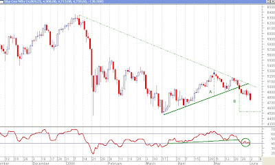
We have the daily chart of the Nifty with us today. I’ve not included many things on the charts today, so as to keep it very simple for the readers. I am now going to explain what I have included, what my reading is about the chart and why I feel so. I always like to give reasons for my analysis and it is there for everybody to see. As you can see from the chart, there are two trendlines – a downward sloping dashed trendline and an upward sloping solid trendline. The solid trendline shows where the Nifty broke through the support line and showed that a downtrend could start. And the dashed trendline shows the level above which the Nifty should come back in an uptrend. As one can see, and as has been mentioned, a downtrend was signaled when the Nifty came below 4990 and an uptrend would be signaled when the Nifty crosses the dashed trendline which today stands at 5020. Since this line is sloping downwards, this level would keep changing everyday.
Posted by
0
comments
((•)) Hear this post
Labels: Head and Shoulders pattern, Nifty, Relative Strength Index