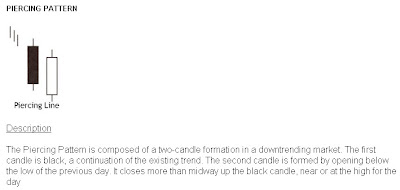
 Seen above is the daily chart of the Nifty. Looking at the last two candles, according to candlestick charting, we got a very good piercing pattern. A small image is also given below to help you understand what a piercing pattern is.
 The criteria to recognise a piercing pattern is the following:
 - The body of the first candle is black (shaded); the body of the second candle is white (unshaded).
- The downtrend has been evident for a good period. A long black candle occurs at the end of the trend.
- The second day opens lower than the trading of the prior day.
- The white candle closes more than halfway up the black candle.
If you notice these criteria, you would see that today’s pattern on the chart fits exactly with this. This may probably mean that this is the end of the downtrend, at least for sometime. For the time being, let us forget the head and shoulders pattern that we saw yesterday and hope for the best. More candlestick patterns can be read on this page.
I got a few mails today in response to the post I wrote yesterday. A lot of my readers were “disheartened” by my analysis of the markets and the ‘shuddering’ thought of the Nifty possibly going to 2600. One of them even asked me to ‘give some rays of hope’. I forgot that, like a doctor keeps giving hope and comfort to his patients and his/her family members even if the survival chances are bleak, I too, with so many blog readers, need to ‘give rays of hope’ when the markets are looking bad.
Yes, I understand that I may have painted a very grim picture yesterday but I thought my readers had to be aware of what could be a possibility. It is to be understood that it is only a possibility and not a certainty. More risk averse investors should be getting out of the markets if we were to go below 4450. And how will they exit if I don’t tell them where to exit? I have to cater to all audiences and it is my duty to bring out all possible scenarios. I admit that I may have erred by not including the positives in yesterday’s post.
Well, all is not lost yet. We have support at 4530, which held today. The three year trendline (and not the eight year trendline that one of my readers got confused with) that the Nifty might break is a very long trendline and one odd going through the line is not considered as a breakdown, it needs to be consistently below the line for a week or so to get a confirmation of a breakdown. Secondly, the head and shoulders pattern shown yesterday was on the weekly charts and took a year and 4 months to form and the target could take as long to be achieved. Markets change drastically in such a long time and such large patterns are more likely to fail than short term patterns. And today’s piercing pattern boosts our morale a little. All may not be lost yet.
In my webinar on moving averages I had mentioned that when multiple moving averages converge together or come very close to each other it means that a big movement is about to come. This is a derivative of the age old Dow Theory. One of the tenets of the Dow Theory is that ‘lines indicate movement’. By ‘lines’ Charles Dow meant the prices moving in a very narrow range or within a small rectangle. This narrow range usually indicates that a movement is about to come. About moving averages when they converge together it means the prices have been moving very close to a particular price level for long (in the present scenario the 5000 level) because of which all moving averages are also very close to each other. This indicates a ‘lull before the storm’ or that a big movement is about to come. This movement could be either up or down. On the past several occasions it has happened that after such a scenario the prices went up but they could very well go down too. This theory only states that a big movement will/may come and does not necessarily state the direction of the movement. One of my readers mistook it to mean that it meant prices would go up. In the present scenario all moving averages are pretty close to each other and they indicate that a big movement is likely anytime soon. This could be on the downside if we go below 4450 or on the upside if we cross 5300. Let us all hope for the best and let the markets decide which way they want to go.
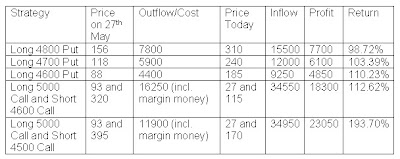
In my post dated 27th May 2008, I had advised buying Nifty 4800, 4700 or 4600 puts or buying a 5000 call and selling 4600 or 4500 call. Let us see with the help of this table how much profit we would have made if we had followed any of those strategies on 28th May and covered the positions today with just one lot of Nifty (50 Nifties).
 Such good returns in a matter of only 8 days and that too when the market is going down and with a maximum investment of only Rs.16000 odd. And all these profits are on just one lot of Nifty. One with Rs.50000/- to invest could have bought 4 to 5 lots of Nifty options and could have easily ended up with more than a lakh in just eight days. Keep watching this space for more such strategies whenever they come. Subscribe to my posts now so that you don’t miss any such profitable strategies.
Happy Investing!!!


1 comment:
thanks for the webinar on moving averages, very informative, clear and concise. i look foward to your further webinars. thank you much appreciated
Post a Comment